I’m happy to share some draft logo concepts I’ve been working on for the Inland Fatherhood Initiative. After our discussions about creating a visual identity that genuinely connects with fathers and clearly communicates our mission, I’ve developed several options that I’d love your thoughts on.
Design Approach
I went with a vibrant orange as our signature color – it’s energetic, warm, and stands out while conveying the optimism and approachability we want to project. This color choice creates an inviting feeling while ensuring our materials will be instantly recognizable in the community.
The white silhouettes against the orange background create what I hope are powerful, emotional images that speak directly to our mission of strengthening father-child relationships. I’ve explored a few different compositions:
Father and child walking hand-in-hand
Complete family unit showing the father’s role within the broader family context
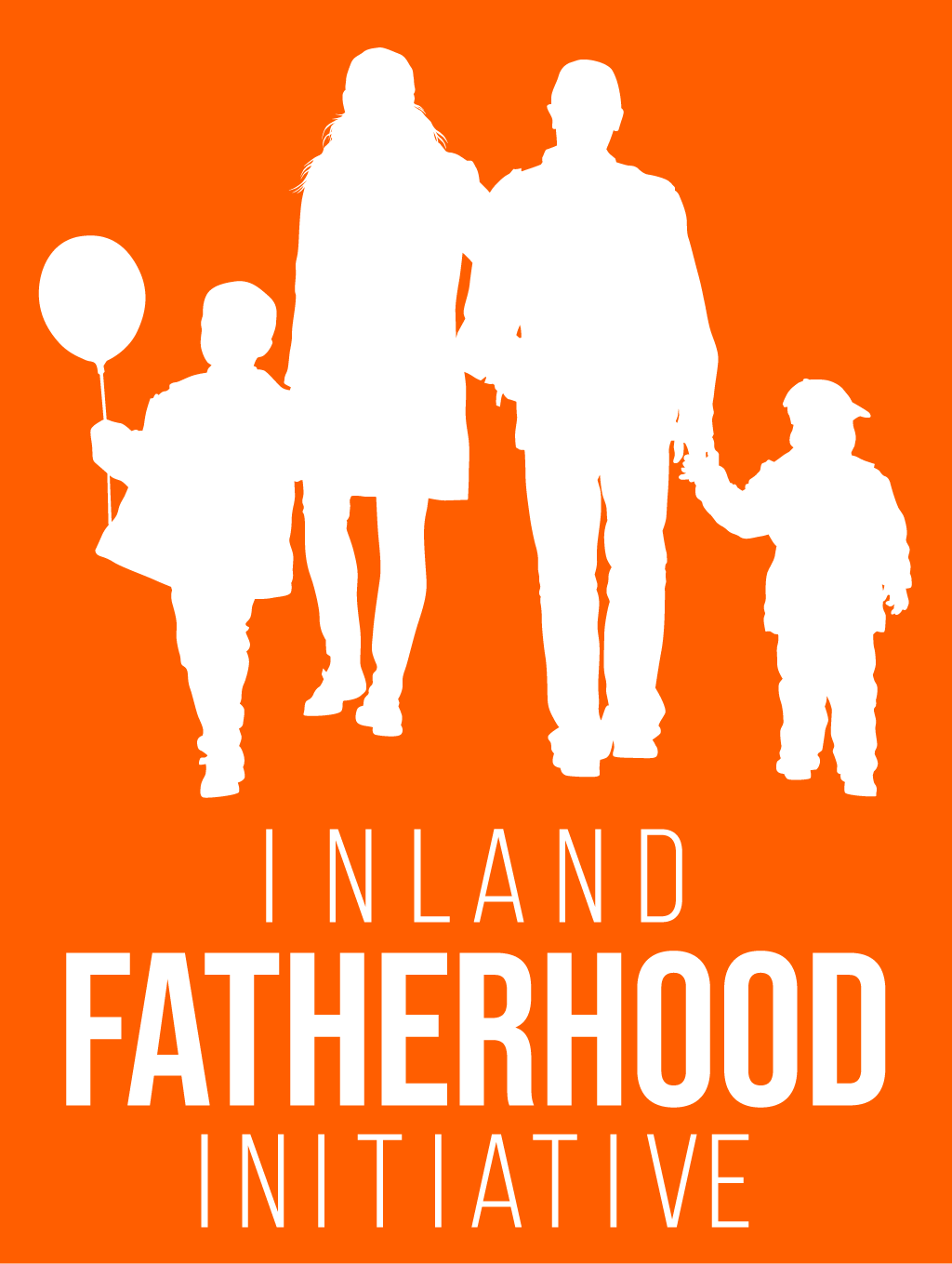
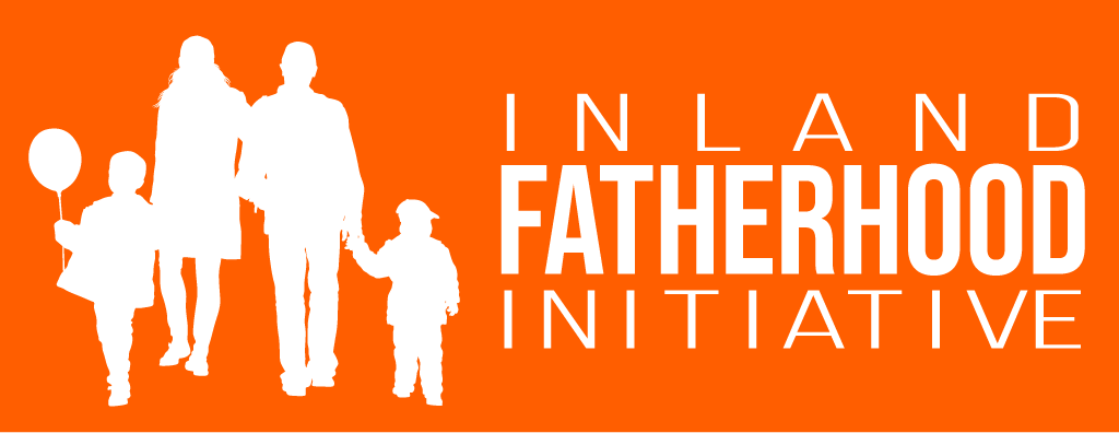
Various positioning options to give us flexibility for different applications
The typography is bold and straightforward – communicating strength and clarity. I know the spacing needs work, and we’ll refine that once we narrow down our preferred direction.
What I’m Looking For
I’d appreciate your honest thoughts on:
- Which concept best captures the spirit of what we’re building
- If the orange feels right for our audience
- Whether the father-child only silhouettes or the family unit better represents our mission
- Any specific elements you’d adjust or refine
I believe these concepts have potential to capture what we’re trying to build – a strong, supportive community that celebrates and strengthens the unique bond between fathers and their children.
Looking forward to your feedback in the comments!
Leave a Reply to Cassandra Cancel reply